Claude Usage Stats
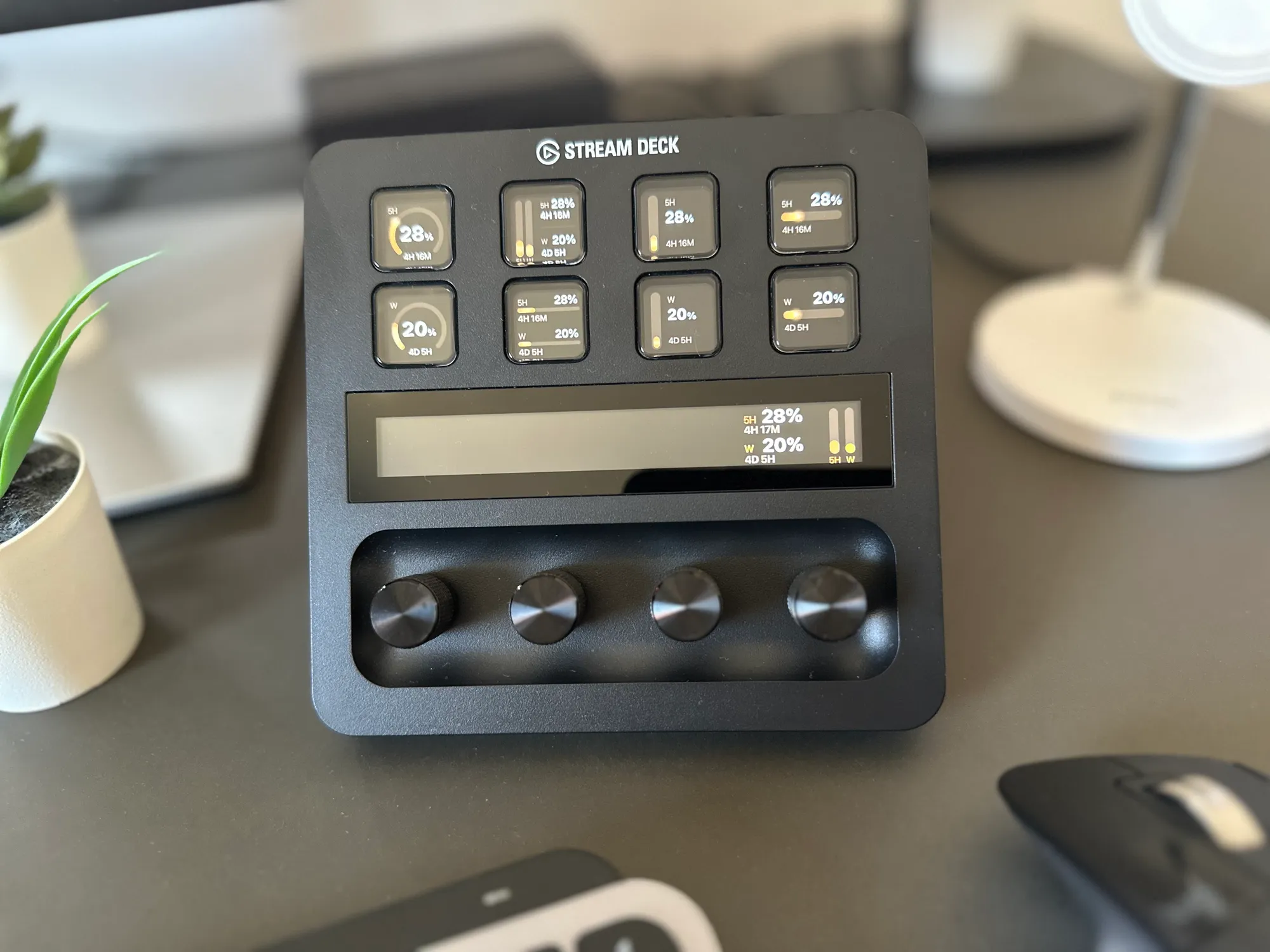
A Stream Deck plugin that keeps my Claude usage on my desk and gets the number right: the 5-hour and weekly limits with live reset countdowns, drawn as custom gauges on the keys and the touchscreen dial. The other plugins estimate from local logs and drift. This one reads the real limit.
 ⤢ Click to zoom
Why I built it
I wanted my Claude usage where I could see it, on my desk, without alt-tabbing to the terminal to check. I tried five Stream Deck plugins for exactly that and got five different numbers, and not one of them matched what Claude actually reported. So I built my own.
It is also how I keep my hands in the build. I design software for a living, and a tool this size is the right place to take an idea all the way to a working product, hardware included, instead of writing it up in a spec and handing it off.
The other plugins estimate your usage from local logs, which drifts. Mine reads the real limit, so the number on the dial matches the terminal down to the percent.
What it does
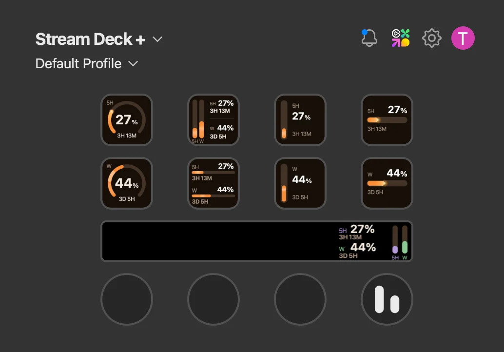
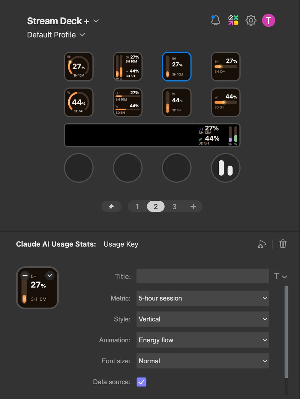
It comes as two pieces. A key shows a single limit as a gauge, an orbiting ring, a meter, or a bar, and the touchscreen dial shows the session and weekly limits together, each with the time left until it resets. Everything refreshes on its own in the background.
- One limit per key, your pick. The 5-hour session or the weekly limit, each drawn as an orbit, meter or bar gauge.
- The dial shows the whole picture. Session and weekly side by side on the touchscreen, each with a live countdown to its reset.
- Accurate, not estimated. It reads the same usage figure Claude itself reports, so what you see matches the terminal exactly.
- A clear near-the-limit cue. Cross ninety percent and the number starts to blink, so the alert reads instantly without the colour you chose shifting around.
- Tuned by feel. Rotate, press or tap the dial to cycle the gauge colour, and hold it to force a refresh.
 ⤢ Click to zoom
 ⤢ Click to zoom
How it works
Getting the number right was a data problem before it was a design one. Most plugins reconstruct your usage by adding up local logs, which slowly drifts away from reality. This one reads the authoritative usage figure that Claude Code itself uses, so it never has to estimate, and it lands on the same number as the terminal. A single shared poller fetches it on an interval and every key and the dial read from that one cache, so the plugin stays light on the API no matter how many gauges are on screen.
The detail I am proudest of is not a feature. The token Claude Code uses is short-lived and gets renewed lazily, so there are normal windows where it is briefly stale. My first version read that as signed-out and flashed a sign-in screen while I was very much signed in. Now it holds the last good reading with a small marker and recovers on its own at the next poll.
The device only ever shows a still image, so every key and the whole dial are custom SVGs I render to an image and push to the hardware, with animations driven by a frame loop. The dial is two hundred by one hundred pixels and a gauge bar is about twelve pixels wide, and that constraint did the design a favour: at that size anything fussy turns to mush, so the whole thing got simpler and clearer than I first drew it.
How I built it
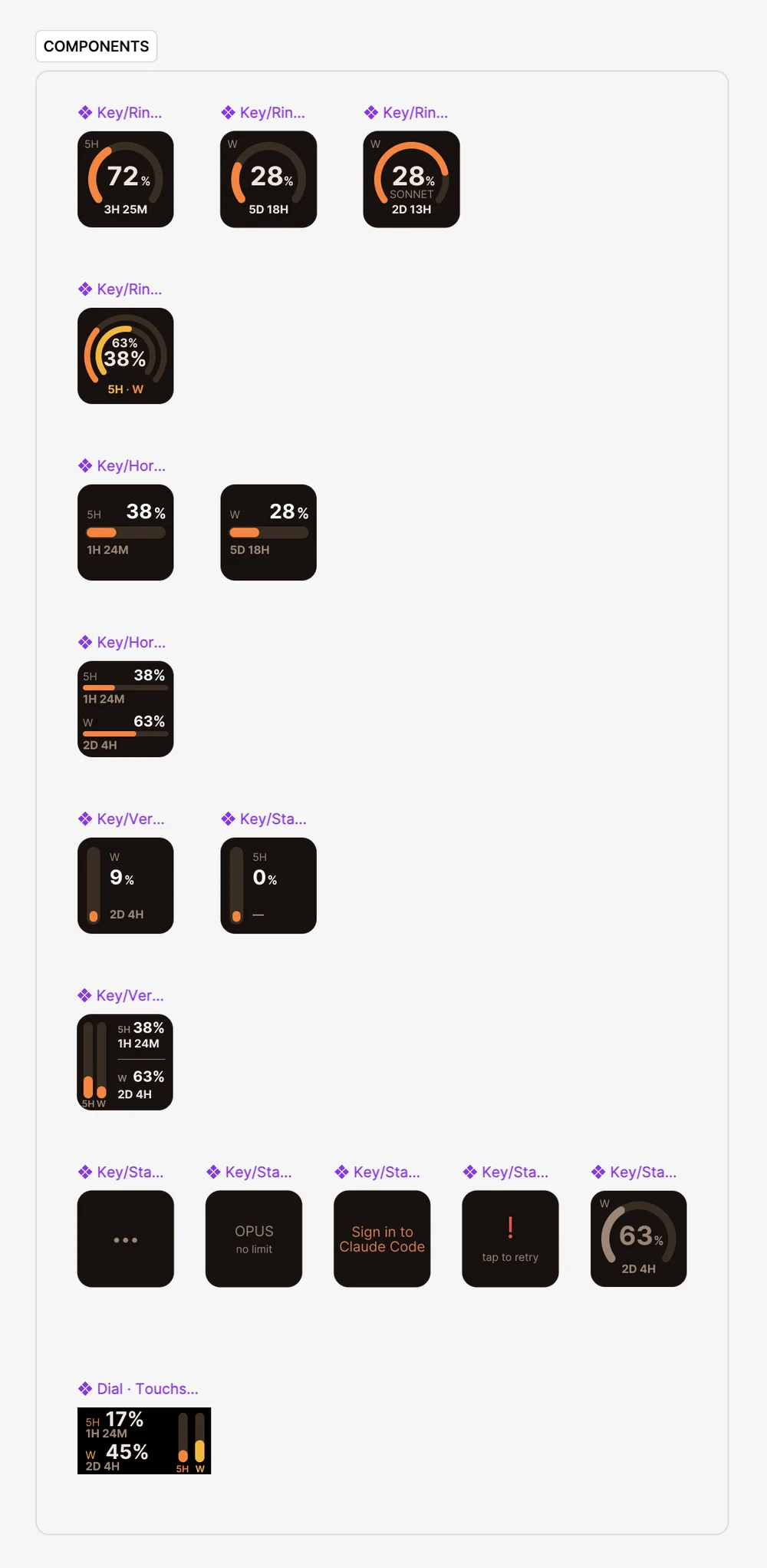
Built solo in an afternoon, in two passes. First I vibe-coded a working version with Claude Code. It read the right numbers and ran on the device, but it had no real design behind it yet. Then I did the part I am actually good at and built a proper design system in Figma, primitives first, then tokens, then the gauge components on top. Figma became the single source of truth: I could nudge an arc there, sync it to the device, and the gauge on my desk matched the one in my file exactly.
 ⤢ Click to zoom
The AI got it to it works fast. The part that made it mine was still all on me.